Ad Gefrin Anglo-Saxon Museum and Whisky Distillery | Wooler, UK
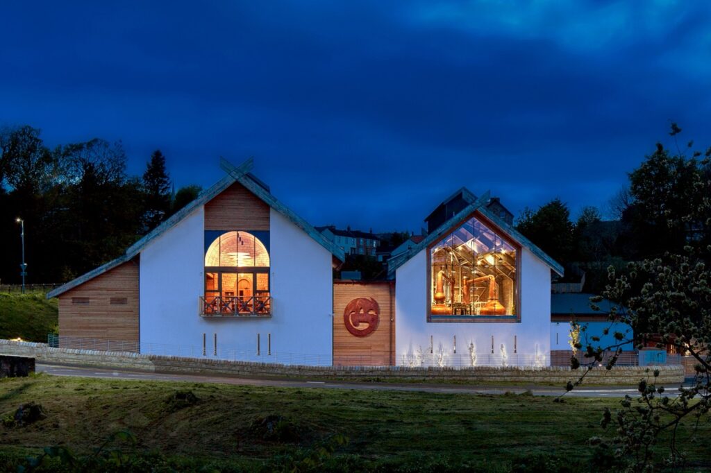
Ad Gefrin reawakens the Northumbrian tradition for whisky. Launched in March 2023, it was a unique opportunity to illuminate a brand new museum, visitor experience and whisky distillery, located at the centre of the local village community in Wooler, an area steeped in Anglo-Saxon history. The distillery borders Northumberland National Park, home to the darkest skies in the UK.
Award-winning Lighting Scheme
Michael Grubb Studio was directly appointed at the early stages of planning in 2019 by the local client Alan, Eileen and Chris Ferguson to create a Lighting Design. The brief was for the lighting to showcase the Ad Gefrin brand and narrate a visitor experience in multiple areas serving different functions. The spaces include a working whisky Distillery, Atrium Entrance, Bistro, Barrel Store, Retail, Function Room, and Museum.
Showcasing the Ad Gefrin brand and supporting the local community were fundamental. The project involved local companies and craftspeople to create a landmark and legacy that celebrated their rich ancestry for future generations to enjoy and benefit from.
The use of natural light played a vital role in the design, with large windows allowing in plenty of daylight. After dark, minimal lighting extends winter use and creates a warm ambience, selecting a low level of brightness to respect the dark skies. Additionally, all exterior lighting scheme keeps low level and minimal, to assist with wayfinding along key routes around the building.
Ad Gefrin Design Collaboration
The new building design was led by local Northumbrian architect, Richard Elphick, with exhibition design by Studio MB. There was meticulous attention to detail, using traditional and contemporary materials and the finest of finishes. World renowned family run company Forsyth Ltd supplied the copper stills. Ad Gefrin’s, innovative design teams combined traditional techniques, sustainable design practices and modern efficiencies.
Lighting The Atrium Entrance
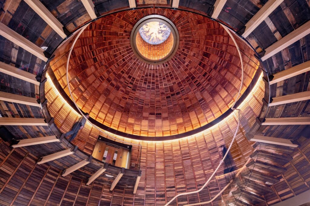
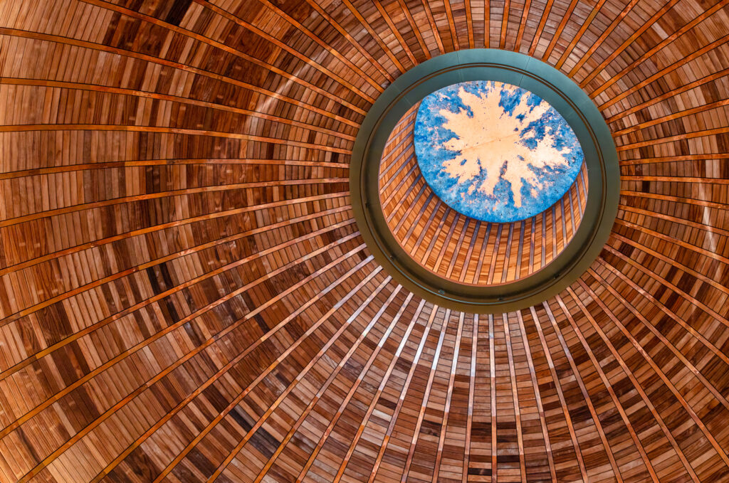
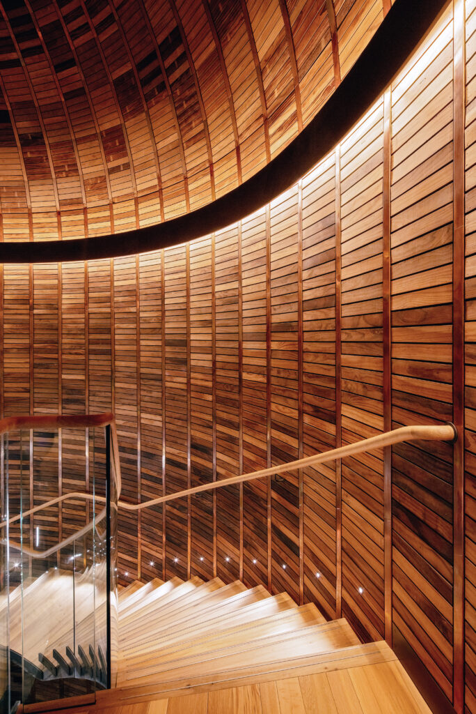
The impressive, domed Atrium entrance sets the tone, light encircles the space, drawing the gaze up to the copper skylight. Sophisticated, welcoming, warm, lighting highlights the architectural design and fabric of the building connecting people with their surrounding, natural environment. Due to its form, materials and the hand craftwork involved in the design and construction of the Atrium, its charm was also its challenge, particularly for integrating lighting within the dome and spiral staircase. The Lighting Design approach had to suit the traditional construction techniques used. Therefore, required more time and consideration, but ultimately the Atrium has a crafted, beautiful high-end finish.
“The process of integrating and challenging design often promotes innovation and benefits the end result. Typically, we could have chosen an encapsulated, acrylic, flexible linear product to suit the curvature of the dome. However, following a series of lighting tests, multiple straight shorter lengths of LED luminaires were chosen as they delivered a brighter lit effect, with a lower wattage output, whilst short lengths could individually be removed and easily upgraded or maintained over time due to the product’s design and materiality, making this approach both more effective and sustainable.“
Melissa Byers, Head of Bournemouth Studio of Michael Grubb Studio
Hospitality Lighting Driven By Purpose And Function
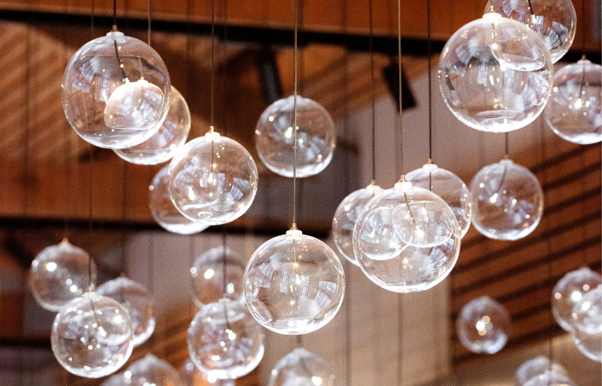
The Bistro is a multi-functional bar, café and restaurant which caters for visitors and locals. During the day, the space is flooded with light, so it was important to select a design that had as much presence by day as it did by night. A bespoke decorative light feature was created using 270 spherical, glass globes internally illuminated by fibre optics suspended from the ceiling. The light feature design was inspired by Northumberland’s stars cape.
The lighting layout and installation of the optical fibres presented as a challenge, due to the shallow, sloped, narrow, wooden slatted ceiling design and ductwork resulting in potentially long optical fibre runs across the ceiling. The layout and design needed to counter this to minimise excessive optical fibres lengths which can result in green discolouration to the optical fibres. Hence, significant, co-ordination and planning went into the design and installation approach in advance, to establish the layout with the optical fibre lengths cut by hand on site and curated by eye to produce the final, organic arrangement.
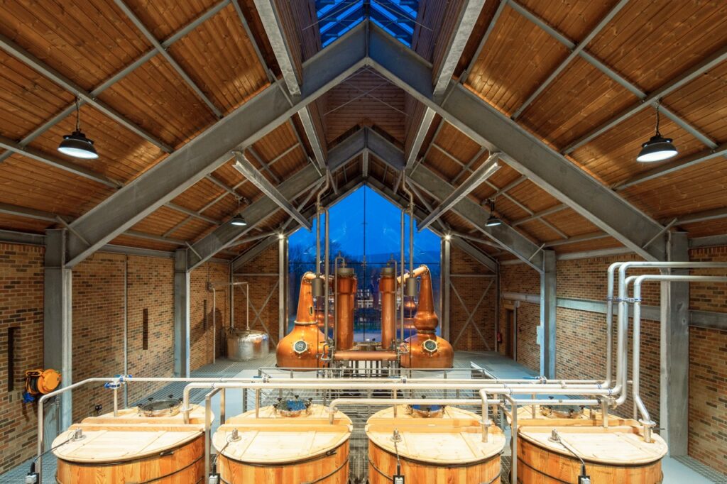
Moreover, the lighting also needed to serve multiple functions, sometimes with challenging operational requirements, such as in the Distillery, an ATEX rated, potentially explosive working environment, also experienced by visitors on tours. Functional lighting was combined with decorative lighting to create two lighting scenes to support each requirement. Directional, warm spotlights illuminate the distillery copper pot stills. This design decision enhances the raw materials and textures, as well as highlights interior architectural features that create a community focal point after dark visible through large arched windows from the street.
Ad Gefrin Visitor Experience Lighting
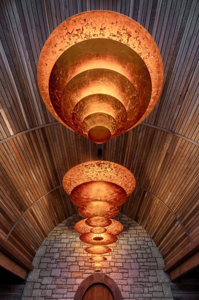
Adjacent to the Distillery is the Function Room, featuring an impressive, vaulted ceiling, also visible from the street through large windows. A series of pendant designs were reviewed, ultimately resulting in the selection of large, curved, tiered copper-leafed pendants that make a visual connection through their form, materiality and warmth with the copper Distillery pot stills.
The quantity of pendants, scale, number of tiers, orientation of the tiers and layout were all tested in 3D in order to create the best visual impact experienced internally, as well as externally from the street view. As a result, the final design settled upon includes three pendants, and alongside the pot stills, they create a striking landmark viewed from the exterior that celebrates the Ad Gefrin Brand.
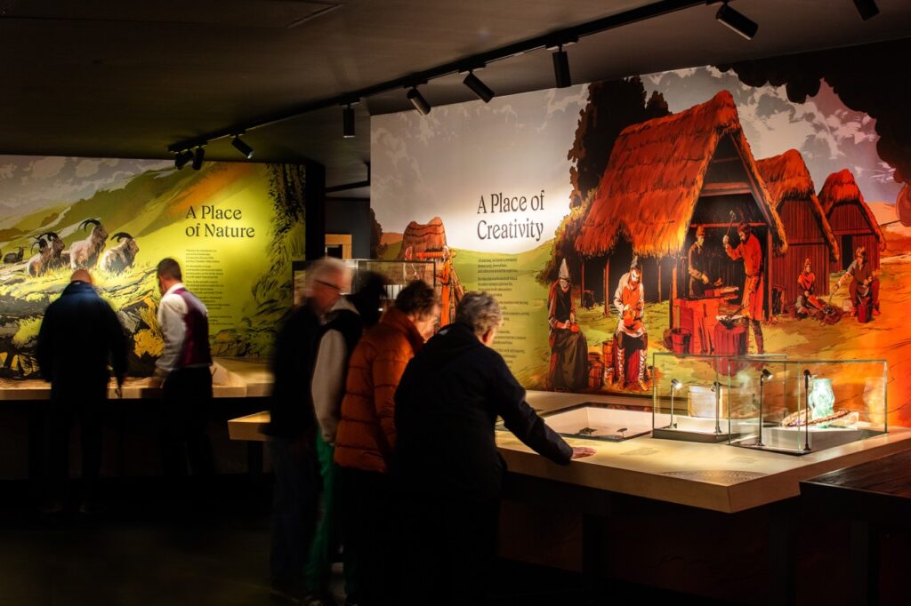
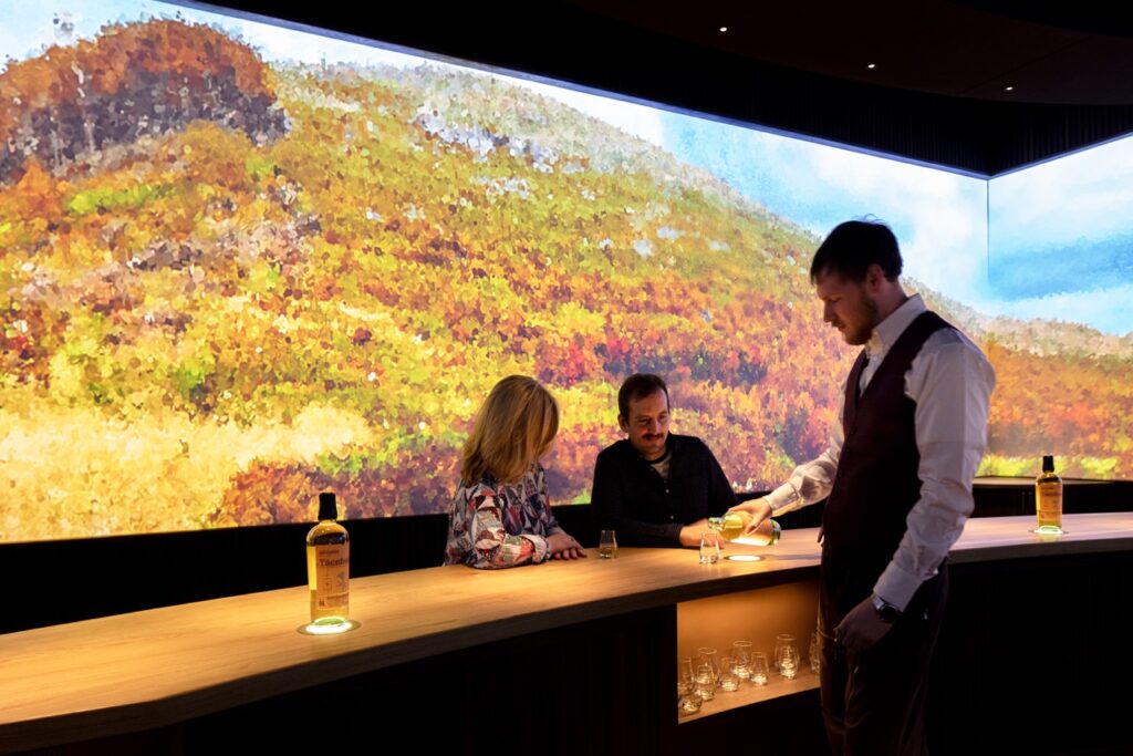
The Lighting Design for the visitor experience includes a Tasting Room, Retail, Museum and Great Hall. The lighting within the tasting experience keeps to an absolute minimal by using very, narrow beam, discretely mounted spotlights and LED light sheets to highlight the colour and qualities of the whisky, specifically, allowing the rest of the room to fall into darkness to support the 360 degree AV experience.
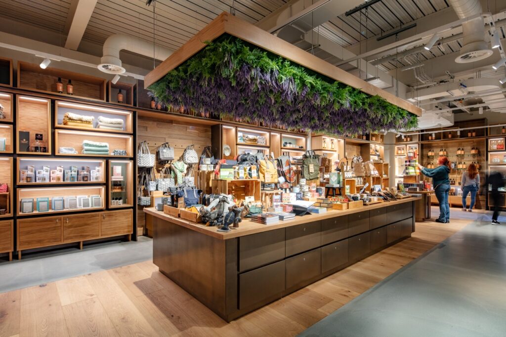
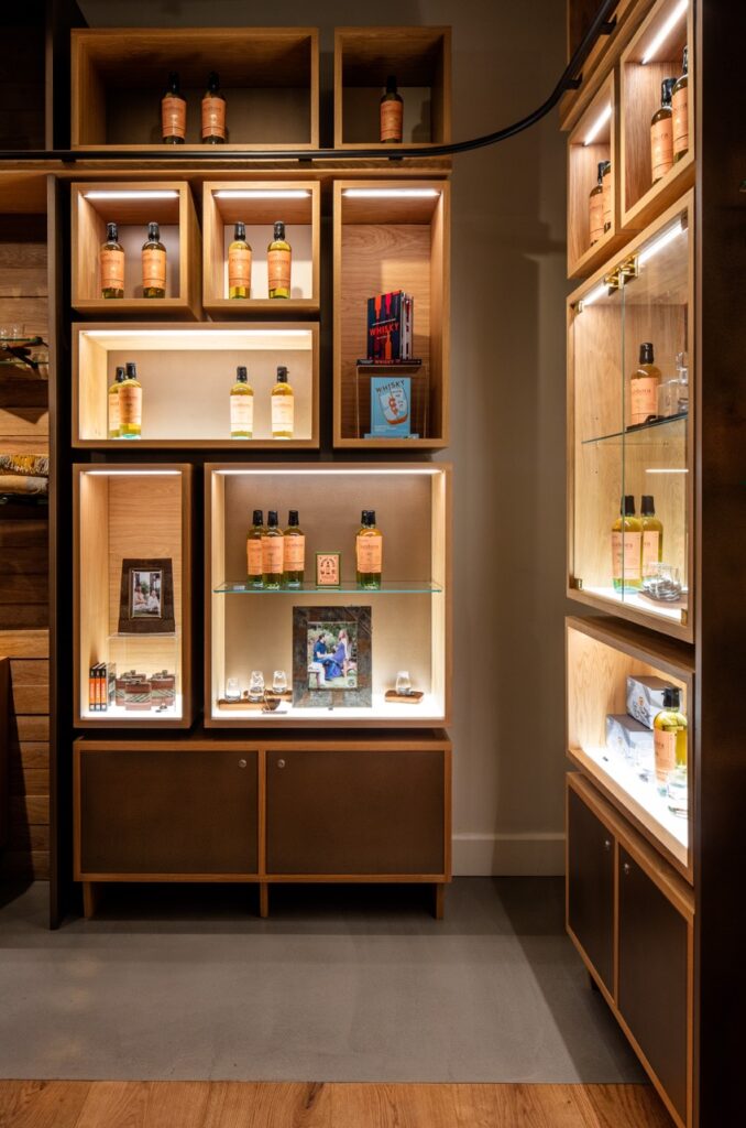
Similarly, discrete approach was also used in the Great Hall and Museum to ensure that the artefacts and AV are the key focal point. Retail lighting in the shop at higher level provides a clear floor area for visitor movement and allows the space and displays to be used flexibly with feature lighting to highlight products available for sale.
“There was a real investment in the local community throughout this project. The clients are a family-run business who were committed to involving and benefitting local people. This level of care can be seen throughout the details of the project and the high quality of the result, due to their craftsmanship and personal attention to detail. This is something that they really wanted the community to be proud of.
The success of this project is also due to teamwork and all the pieces coming together. A good working relationship between the client, contractor, designers, and engineers created a pleasant experience and a real harmony to the project.”
Michael Grubb, Founder and Managing Director of Michael Grubb Studio
“We could not be happier with the result of the lighting design. Michael Grubb Studio worked closely with us on the process of how to bring our vision to life, allowing us to take a personal approach to the project. One of the things we have enjoyed so much about this project has been the process of seeing the design come to life from the initial concepts to the finished project onsite.
We are incredibly proud of what the team have accomplished, creating a space which serves the local community while demonstrating our values and style as a brand.”
Eileen Ferguson, Co-founder of Ad Gefrin
Client
Ad Gefrin: Alan, Eileen and Chris Ferguson
Architect
Richard Elphick, supported by Todd Milburn, Red Fox, and JCP
Design Team
Studio MB (Interior), Brims Construction Ltd (Construction)
Photographer
Sally Ann Norman
Location
Wooler, United Kingdom
Awards
RIBA North East Awards 2025 (Shortlisted), Lighting Design Awards 2023 (Winner), MUSE Awards 2023 (Platinum Winner), Scottish Design Awards 2024 (Silver Award Winner), Dezeen Awards 2023 (Longlist), Surface Design Awards 2024 (Finalist), d'arc awards 2024 (Shortlisted)
